Table of Contents
- 1 A general work flow for any project where you deal with data
- 2 Visualization with Pandas
- 3 Box plots (and histograms): using the Ammonia case study
- 4 Time-series, or a sequence plot
- 5 DataFrame operations
- 6 Scatter plots
- 7 Saving your plots
- 8 Demonstration time
- 9 Diversion: how is time represented in Python?
All content here is under a Creative Commons Attribution CC-BY 4.0 and all source code is released under a BSD-2 clause license.
Please reuse, remix, revise, and reshare this content in any way, keeping this notice.
Course overview
This is the third module of several (11, 12, 13, 14, 15 and 16), which refocuses the course material in the prior 10 modules in a slightly different way. It places more emphasis on
- dealing with data: importing, merging, filtering;
- calculations from the data;
- visualization of it.
In short: *how to extract value from your data*.
Module 13 Overview
This is the third of 6 modules. In this module we will cover
- Becoming more comfortable with Pandas data processing
- Basic plotting with Pandas
Requirements before starting
- Have your Python installation working as you had for modules 11 and 12, and also the Pandas and Plotly libraries installed.
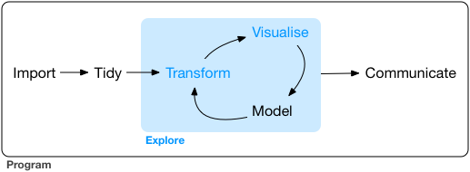
A general work flow for any project where you deal with data
*After years of experience, and working with data you will find your own approach.*
Here is my 6-step approach (not linear, but iterative): Define, Get, Explore, Clean, Manipulate, Communicate
- Define/clarify the objective. Write down exactly what you need to deliver to have the project/assignment considered as completed.
Then your next steps become clear.
Look for and get your data (or it will be given to you by a colleague). Since you have your objective clarified, it is clearer now which data, and how much data you need.
Then start looking at the data. Are the data what we expect? This is the explore step. Use plots and table summaries.
Clean up your data. This step and the prior step are iterative. As you explore your data you notice problems, bad data, you ask questions, you gain a bit of insight into the data. You clean, and re-explore, but always with the goal(s) in mind. Or perhaps you realize already this isn't the right data to reach your objective. You need other data, so you iterate.
Modifying, making calculations from, and manipulate the data. This step is also called modeling, if you are building models, but sometimes you are simply summarizing your data to get the objective solved.
From the data models and summaries and plots you start extracting the insights and conclusions you were looking for. Again, you can go back to any of the prior steps if you realize you need that to better achieve your goal(s). You communicate clear visualizations to your colleagues, with crisp, short text explanations that meet the objectives.
The above work flow (also called a 'pipeline') is not new or unique to this course. Other people have written about similar approaches:
- Garrett Grolemund and Hadley Wickham in their book on R for Data Science have this diagram (from this part of their book). It matches the above, with slightly different names for the steps. It misses, in my opinion, the most important step of *defining your goal* first.
- Hilary Mason and Chris Wiggins in their article on A Taxonomy of Data Science describe their 5 steps in detail:
- Obtain: pointing and clicking does not scale. In other words, pointing and clicking in Excel, Minitab, or similar software is OK for small data/quick analysis, but does not scale to large data, nor repeated data analysis.
- Scrub: the world is a messy place
- Explore: you can see a lot by looking
- Models: always bad, sometimes ugly
- Interpret: "the purpose of computing is insight, not numbers."
You can read their article, as well as this view on it, which is bit more lighthearted.
What has been your approach so far?
Visualization with Pandas
In this module we want to show how you can quickly create visualizations of your data with Pandas.
But first, you should check if you are using the appropriate visualization tool. This website helps you select: https://www.data-to-viz.com
In this module we will consider:
- box plots
- bar plots (histograms only; general bar plots will come later)
- time-series (sequence plots),
- scatter plots (plot one column against another column).
Box plots (and histograms): using the Ammonia case study
We will implement the 6-step workflow suggested above.
Defining the problem (step 1)
Our (1) objective is to
Describe what time-based trends we see in the ammonia concentration of a wastewater stream. We have a single measurement, taken every six hours.
We will first see how we can summarize the data.
Getting the data (step 2)
The next step is to (2) get the data. We have a data file from this website where there is 1 column of numbers and several rows of ammonia measurements.
Overview of remaining steps
Step 3 and 4 of exploring the data are often iterative and can happen interchangeably. We will (3) explore the data and see if our knowledge that ammonia concentrations should be in the range of 15 to 50 mmol/L is true. We might have to sometimes (4) clean up the data if there are problems.
We will also summarize the data by doing various calculations, also called (5) manipulations, and we will (6) communicate what we see with plots.
Let's get started. There are 3 ways to get the data:
- Download the file to your computer
- Read the file directly from the website (no proxy server)
- Read the file directly from the website (you are behind a proxy server)
# Import the plotly library
import plotly.graph_objects as go
import plotly.io as pio
pio.renderers.default = "iframe" # "notebook" # jupyterlab
import pandas as pd
pd.options.plotting.backend = "plotly"
# Loading the data from a local file, if you have it saved to your own computer
data_file = r'C:\location\of\file\ammonia.csv'
waste = pd.read_csv(data_file)
# Read the CSV file directly from a web server:
import pandas as pd
waste = pd.read_csv('https://openmv.net/file/ammonia.csv')

# If you are on a work computer behind a proxy server, you
# have to take a few more steps. Uncomment these lines of code.
#
# import io
# import requests
# proxyDict = {"http" : "http://replace.with.proxy.address:port"}
# url = "http://openmv.net/file/ammonia.csv"
# s = requests.get(url, proxies=proxyDict).content
# web_dataset = io.StringIO(s.decode('utf-8'))
# waste = pd.read_csv(web_dataset)
Show only the first few lines of the data table (by default it will show 5 lines)
waste
Print the last 10 rows of the data to the screen:
Exploration (step 3)
Once we have opened the data we check with the .head(...) command if our data are within the expected range. At least the first few values. Similar for the .tail(...) values.
Those two commands are always good to check first.
Now we are ready to move on, to explore further with the .describe(...) command.
# Run this single line of code, and answer the questions below
waste.describe()
Check your knowledge
There are ______ rows of data. Measured at 6 hours apart, this represents ______ days of sensor readings.
We expected ammonia concentrations to typically be in the range of 15 to 50 mmol/L. Is that the case from the description?
What is the average ammonia concentration?
Sort the ammonia values from low to how, and store the result in a new variable called
ammonia_sorted.What does the 25th percentile mean? Below the 25th percentile value we will find ____% of the values, and above the 25th percentile we find ____% of the values. In this case that means the 25th percentile will be close to value of the 360th entry in the sorted vector of data. Try it:
ammonia_sorted[358:362]What does the 75th percentile mean? Below the 75th percentile value we will find ____% of the values, and above the 75th percentile we find ____% of the values. In this case that means the 75th percentile will be close to value of the 1080th entry in the sorted vector of data. Try it:
ammonia_sorted[1078:1082]So therefore: between the 25th percentile and the 75th percentile, we will find ____% of the values in our vector.
Given this knowledge, does this match with the expectation we have that our Ammonia concentration values should lie between 15 to 50 mmol/L?
And there is the key reason why you are given the 25th and 75th percentile values. Half of the data in the sorted data vector lie between these two values. 25% of the data lie below the 25th percentile, and the other 25% lie above the 75th percentile, and the bulk of the data lie between these two values.
# Add your code here to answer the above questions.
Introducing the box plot
We have looked at the extremes with .head() and .tail(), and we have learned about the mean and the median.
What about the typical values? What do we even mean by typical or usual or common values? Could we use the 25th and 75th percentiles to help guide us?
One way to get a feel for that is to plot these numbers: 25th, 50th and 75th percentiles. Let's see how, by using a boxplot.
waste.boxplot()
In general, it is worth taking a look at the documentation for the function you are using here. This is available on the Pandas website:
https://pandas.pydata.org/pandas-docs/stable/reference/api/pandas.DataFrame.boxplot.html
which you can quickly find by searching for pandas boxplot, and the first link as result will likely be the one above.
The boxplot gives you an idea of the distribution, the spread, of the data.
The key point is the orange center line, the line that splits the centre square (actually it is a rectangle, but it looks squarish). That horizontal line is the median.
It is surprising to see that middle chunk, that middle 50% of the sorted data values fall in such a narrow range of the rectangle.
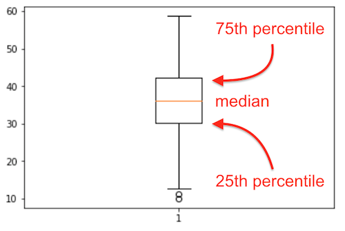
![]() The bottom 25% of the data falls below the box, and the top 25% of the data falls above the box. That is indicated to some extent by the whiskers, the lines leaving the middle square/rectangle shape. The whiskers tell how much spread there is in our data. We we see 2 single circles below the bottom whisker. These are likely outliers, data which are unusual, given the context of the rest of the data. More about outliers later.
The bottom 25% of the data falls below the box, and the top 25% of the data falls above the box. That is indicated to some extent by the whiskers, the lines leaving the middle square/rectangle shape. The whiskers tell how much spread there is in our data. We we see 2 single circles below the bottom whisker. These are likely outliers, data which are unusual, given the context of the rest of the data. More about outliers later.
Now let us try plotting a histogram of these same data.
waste.hist()

# Search for the documentation for this function. Adjust the number of bins to 30.
# Add code here for a histogram with 30 bins.
# Make the figure less wide and less high:
waste.hist(width=400, height=400)
# AIM: create a histogram, with extra annotations
# `fig` is a Plotly figure:
fig = waste.hist(nbins=30)

# With this variable you can further manipulate the plot. Use it, for example, to add an x-axis label:
fig.update_layout(xaxis_title_text='Ammonia concentration [mmol/L]')
#
# Update the y-axis label here:


# Superimpose the 25th and the 75th percentiles as vertical lines (vlines) on the histogram
fig.add_vline(x=waste['Ammonia'].quantile(0.25), line_color="purple", line_width=1, line_dash='solid')
fig.add_vline(x=waste['Ammonia'].quantile(0.75), line_color="purple", line_width=1, line_dash='solid' )
fig.add_hline(y= 80, line_dash='longdash', annotation_text="Cutoff")
fig.add_vline(
    x=waste['Ammonia'].quantile(0.50),
    line_color="orange",
    line_width=3,
    annotation_text="Median",
    line_dash='longdash') # 'dot', 'dash', 'longdash', 'dashdot', 'longdashdot'


# Make the range bigger (e.g. to match requirements in a technical report)
fig.update_layout(xaxis_range=[0, 70],
                  yaxis_range=[0, 200])
display(fig)

# NOTE: the 0.5 quantile, is the same as the 50th percentile, is the same as the median.
print(f'The 50th percentile (also called the median) is at: {waste["Ammonia"].quantile(0.5)}')
All of this you can get from this single table which you can create with .describe():
Which brings us to two important points:
- Tables are (despite what some people might say), a very effective form of summarizing data
- Start your data analysis with the
.describe()function to get a (tabular) feel for your data.
Looking ahead
We have not solved our complete objective yet. Scroll up, and recall what we needed to do: "describe what time-based* trends we see in the ammonia concentration of a wastewater stream*". We will look at that next.
Summary
We have learned quite a bit in this section so far:
- head and tail of a data set
- median
- spread in the data
- distribution of a data column
- box plot
- percentile
Time-series, or a sequence plot
If you have a single column of data, you may see interesting trends in the sequence of numbers when plotting it. These trends are not always visible when just looking at the numbers, and they definitely cannot be seen in a box plot.
An effective way of plotting these columns is horizontally, as a series plot, or a trace. We also call them time-series plots, if there is a second column of information indicating the corresponding time of each data point.
Below we import the data.
- The dataset had no time-based column, so Pandas provides a simple function for creating your tie column:
pd.date_range(...). - We were told the data were collected every 6 hours.
- Set that time-based column to be our *index*. Do you recall that term about a Pandas data frame?
waste.shape[0]
waste = pd.read_csv('http://openmv.net/file/ammonia.csv')
datetimes = pd.date_range('1/1/2020', periods=waste.shape[0], freq='6H')

print(datetimes)
# What is this "datetimes" variable we have just created?
waste.set_index(datetimes, inplace=True)
# Why "inplace" ?
# The code to plot the data as a time-series sequence:
fig = waste.plot.line()  # you can also say: waste.plot()
fig
waste.plot()
# Make the plot look a bit different:
fig = waste.plot.line(
    markers=True,
    log_y=True,
    range_y=[5, 85],
    color_discrete_sequence=["orange"],
    width=800,
    height=400,
)
fig.update_layout(showlegend=False)
fig.update_layout(plot_bgcolor="black")
fig = go.Figure()
fig.add_trace(
    go.Scatter(
        x=waste.index,
        y=waste['Ammonia'],
        name="Ammonia",
    )
)
fig.update_layout(showlegend=True)
# The above code is the same as
waste.plot.line()
# Now calculation the the 5-day moving average:
waste['Ammonia'].rolling('5D').mean()

# OK, now plot that moving average:
# Add a rolling average on top of the raw data, to help see the signal through the noise.

# First plot the original data
fig = go.Figure()
fig.add_trace(
    go.Scatter(
        x=waste.index,
        y=waste['Ammonia'],
        name="Ammonia concentration",
        line_color="rosybrown",
    )
)

# Then add the moving average on top
fig.add_trace(
    go.Scatter(
        x=waste.index,
        y=waste['Ammonia'].rolling('5D', center=True).mean(),
        name="5 day moving average",
        line_color="black",
    )
)
fig.update_layout(showlegend=True)
fig.show()

# Later on this code will make more sense; for now, hopefully it is useful in your daily work.
- Try different rolling window sizes:
'12H'(12 hours),'2D'(2 days),'30D', etc.
DataFrame operations
Last time we looked at some basic data frame operations. Let's recap some important ones.
- adding rows,
- deleting rows,
- merging data frames.
We will use this made-up data set, showing how much food is used by each country. You can replace these data with numbers and columns and rows which make sense to your application.
import pandas as pd
data = {'Herring':  [27, 13, 52, 54,  5, 19],
       'Coffee':   [90, 94, 96, 97, 30, 73],
       'Tea':      [88, 48, 98, 93, 99, 88]}
countries = ['Germany', 'Belgium', 'Netherlands', 'Sweden', 'Ireland', 'Switzerland']
food_consumed = pd.DataFrame(data, index=countries)

print(data)
print(countries)
print(type(data))
print(type(countries))
print(type(food_consumed))
food_consumed
Getting an idea about your data first: you are now very comfortable with these
# The first rows:
food_consumed.head()

# The last rows:
food_consumed.tail()

# Some basic statistics
food_consumed.describe()

# Some information about the data structure: missing values, memory usage, etc
food_consumed.info()
1. Shape of a data frame
# There were 6 countries, and 3 food types. Verify:
food_consumed.shape

# Transposed and then shape:
food_consumed.T.shape

# Interesting: what shapes do summary vectors have?
food_consumed.mean().shape
food_consumed
2. Unique entries
food_consumed['Tea'].unique()

# Unique names of the rows: (not so useful in this example, because they are already unique)
food_consumed.index.unique()

# Get counts (n) of the unique entries:
food_consumed.nunique()       # in each column
food_consumed.nunique(axis=1) # in each row
3. Add a new column
# Works just like a dictionary!
# If the data are in the same row order
food_consumed['Yoghurt'] = [30, 20, 53, 2, 3, 48]
print(food_consumed)
display(food_consumed)
4. Joining dataframes
# Note the row order is different this time:
more_foods = pd.DataFrame(index=['Belgium', 'Germany', 'Ireland', 'Netherlands', 'Sweden', 'Switzerland'],
                           data={'Garlic': [29, 22, 5, 15, 9, 64]})
print(food_consumed)
print(more_foods)
# Merge 'more_foods' into the 'food_consumed' data frame. Merging works, even if row order is not the same!
food_consumed = food_consumed.join(more_foods)
food_consumed
5. Adding a new row
# Collect the new data in a Series. Note that 'Tea' is (intentionally) missing!
portugal = pd.Series({'Coffee': 72,  'Herring': 20, 'Yoghurt': 6, 'Garlic': 89},
                    name = 'Portugal')

food_consumed = food_consumed.append(portugal)
# See the missing value created?
print(food_consumed)

# What happens if you run the above commands more than once?
6. Delete or drop a row/column
# Drop a column, and returns its values to you
coffee_column = food_consumed.pop('Coffee')
print(coffee_column)
print(food_consumed)

# Leaves the original data untouched; returns only
# a copy, with those columns removed
food_consumed.drop(['Garlic', 'Yoghurt'], axis=1)
print(food_consumed)

# Leaves the original data untouched; returns only
# a copy, with those rows removed.
non_EU_consumption = food_consumed.drop(['Switzerland', ], axis=0)
7. Remove rows with missing values
# Returns a COPY of the array, with no missing values:
cleaned_data = food_consumed.dropna()

# Makes the deletion inplace; you do not not have to assign the output to a new variable.
# Inplace is not always faster!
food_consumed.dropna(inplace=True)

# Remove only rows where all values are missing:
food_consumed.dropna(how='all')
8. Sort the data
food_consumed.sort_values(by="Garlic")
food_consumed.sort_values(by="Garlic", inplace=True)
food_consumed.sort_values(by="Garlic", inplace=True, ascending=False)
Scatter plots
Scatter plots are widely used and easy to understand. *When should you use a scatter plot?* When your goal is to draw the reader's attention between the relationship of 2 (or more) variables.
- Data tables also show relationships between two or more variables, but the trends are sometimes harder to see.
- A time-series plot shows the relationship between time and another variable. So also two variables, but one of which is time.
In a scatter plot we use 2 sets of axes, at 90 degrees to each other. We place a marker at the intersection of the values shown on the horizontal (x) axis and vertical (y) axis.
Most often variable 1 and 2 (also called the dimensions) will be continuous variables. Or at least *ordinal variables*. You will seldom use categorical data on the $x$ and $y$ axes.
You can add a 3rd dimension: the marker's size indicates the value of a 3rd variable. It makes sense to use a numeric variable here, not a categorical variable.
You can add a 4th dimension: the marker's colour indicates the value of a 4th variable: usually this will be a categorical variable. E.g. red = category 1, blue = category 2, green = category 3. Continuous numeric transitions are hard to map onto colour. However it is possible to use transitions, e.g. values from low to high are shown on a sliding gray scale
You can add a 5th dimension: the marker's shape can indicate the discrete values of a 5th categorical variable. E.g. circles = category 1, squares = category 2, triangles = category 3, etc.
In summary:
- marker's size = numeric variable
- marker's colour = categorical, maybe numeric, especially with a gray-scale
- marker's shape = can only be categorical
Let's use the Bioreactor yields data set. There is information about it here:
http://openmv.net/info/bioreactor-yields
Read in the data into a Pandas data frame, and use the .describe function to check it:
# Standard imports required to show plots and tables
import pandas as pd

yields = pd.read_csv('http://openmv.net/file/bioreactor-yields.csv')
Are all 5 columns shown in the summary? Modify the .describe function call to show information on all 5 columns.
yields
Now plot the data as a scatter plot, using this code as a guide. We want to see if there is a relationship between temperature and yield.
fig = yields.plot.scatter(
    x='temperature',
    y='yield',
    width=500,
    height=400,
    title='Yield [%] as a function of temperature [°C]',
)
fig.update_layout(xaxis_title_text='Temperature [°C]')
fig.update_layout(yaxis_title_text='Yield [%]')
The objective of this data file was to check if there is a relationship between Temperature and Yield. Visually that is confirmed.
Let us also quantify it with the correlation value we introduced above. Calculate the correlation with this code:
display(yields.corr())
display(yields.corr())
The correlation value is $r=-0.746$, essentially negative 75%.
- The correlation value is *symmetrical*: the correlation between temperature and yield is the same as between yield and temperature.
- Interesting tip: the $R^2$ value from a regression model is that same value squared: in other words, $R^2 = (-0.746356)^2 = 0.5570$, or roughly 55.7%.
Think of the implication of that: you can calculate the $R^2$ value - the value often used to judge how good a linear regression is - without calculating the linear regression model!! Further, it shows that for linear regression it does not matter which variable is on your $x$-axis, or your $y$-axis: the $R^2$ value is the same.
If you understand these 2 points, you will understand why $R^2$ is not a great number at all to judge a linear regression model.
Adding more dimensions to your scatter plots
We saw that we can alter the size, colour, and shape of the marker to indicate a 3rd, 4th or 5th dimension.
We consider changing the markers' colour and shape in the next piece of code.
Colour and shape are perfect for categorical variables, but unfortunately in this data set we only have 1 categorical variable. So use it for both the marker's shape (symbol) and colour.
yields['baffles'].unique()

# So we see the "baffles" column is actually text: "Yes" or "No".
# We call this a categorical variable.
# Use the "baffles" column to pick colours
fig = yields.plot.scatter(
    x='temperature',
    y='yield',
    width=500,
    height=400,
    title='Yield [%] as a function of temperature [°C]; colours indicate presence/absense of baffles',
    color="baffles",
    symbol="baffles",
    size="speed",
)
fig.update_layout(xaxis_title_text='Temperature [°C]')
fig.update_layout(yaxis_title_text='Yield [%]')
In the code below we want to make the marker size proportional to the speed of the impeller.
The size input of the .scatter function can be specified as the name of the column to determine the marker size:
# Modify the speed column to be more "spread out" in size
yields['Speed(plot)'] =  (yields['speed']-3200).pow(2) / 1000
yields
fig = yields.plot.scatter(
    x='temperature',
    y='yield',
    width=500,
    height=400,
    title='Yield [%] as a function of temperature [°C]; colours for baffles; size related to impeller speed',
    color="baffles",
    size='Speed(plot)',
)
fig.update_layout(xaxis_title_text='Temperature [°C]')
fig.update_layout(yaxis_title_text='Yield [%]')
Saving your plots
Once you have created your plot you can of course include it in a document. Click on the "camera" icon at the top right hover area.
Demonstration time
Some examples will be shown on what you can do with data frames.
- Dashboards
- Calculations
Diversion: how is time represented in Python?
Try the following in the space below:
from datetime import datetime
now = datetime.now()

# Do some things with `now`:
print(now)
print(now.year)
print(f"Which weekday is it today? It is day: {now.isoweekday()} in the week")
print(now.second)
print(now.seconds) # use singular
After trying the above, try these lines below. Comment out the lines that cause errors.
later = datetime.now()
print(later)
print(type(later))
print(later - now)
print(now - later)
print(now + later)

delta = later - now
print(delta)
print(type(delta))
print(f"There were this many seconds between 'now' and 'later': {delta.total_seconds()}")
print(later + delta)

sometime_in_the_future = later + delta*1000
print(sometime_in_the_future)
print(sometime_in_the_future - now)